


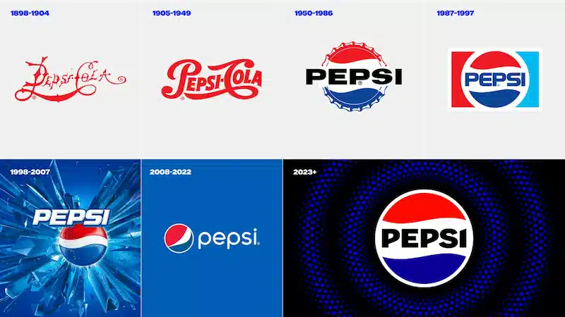


On Tuesday, Pepsi revealed a revamped logo and branding that will be launched in North America later this year and worldwide next year. The new design bears a striking resemblance to the 1990s version that has remained entrenched in people's minds, but with fresh features that give it a more contemporary feel, such as a new font and font color, as well as a new border.
The modifications were made not only to better match people's memories but also to draw attention to Pepsi's zero sugar offerings, which are a critical aspect of the company's expansion strategy.
Pepsi, which has a 125-year history, periodically refreshes its branding. The present visual identity was launched in 2008. However, since its initial introduction, it has become a bit outdated.